Welsh Refugee Council
Visual Brand evolution
Digital & printed bilingual report
Asset packs
Working with the Welsh Refugee Council has been a privilege.
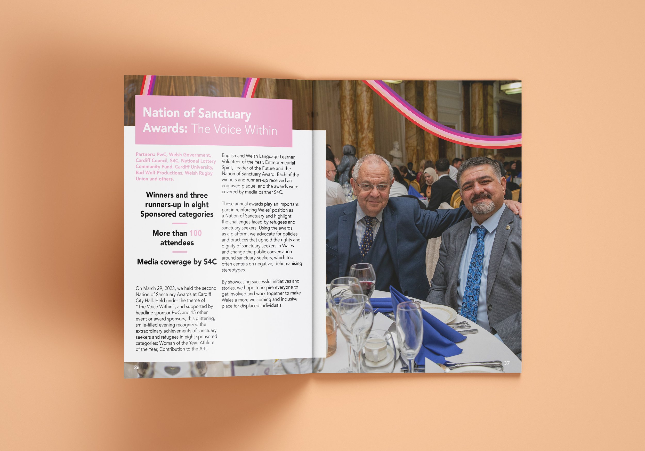
Using their existing logo and colour palette we introduced the use of block colouring to differentiate their many inspiring project case studies.
A new creative element - a rainbow ribbon in two colour ways (inspired by their colourful logo) - encapsulates the journey and transition to a positive future for the many refugees that come to Wales. We used the rainbow ribbons to provide a sense of movement and to also ‘hug’ around some of our case study individuals. The rainbow also represents hope, further reiterating the vision and mission of the charity.
We created a fluid and engaging design in both English and Welsh.


